← All work

Case studies · 2026

This site, v3 → v4

v3 as it shipped — the visual-editor build, captured from v3_old.html

A full rebuild of my own portfolio: out of a visual editor, into hand-written HTML, CSS and JS. The old version shipped 114KB of unused editor tooling and was pinned to a 1473px window.

What this buys a client: the same discipline applied to their site — a page that fits every screen instead of the one it was drawn on, and no third-party payload they never asked for.

Highlights

The problem

The editor wrote absolute positions and 514 hardcoded pixel values into inline styles. Correct on my monitor, broken on every other one.

Dead weight

Two 58KB scripts, byte-identical to each other, downloaded by every visitor and used by none.

The constraint

Hand-written, no build step, no framework. If it does not fit, it does not go in.

What changed

clamp() and auto-fit grids instead of fixed pixels, 6 breakpoints instead of none, 28 aria attributes instead of none.

01 — Diagnosis

What broke, counted not remembered

Every number below came out of the shipped v3 file, which is kept beside this site as v3_old.html — the last v3 commit, changed in two places only: a footer line carrying the legal links, and the tooling’s CDN URLs repointed at local copies. Every count below still runs on it.

Layout

Pinned to one 1473px screen

The visual editor recorded my window instead of describing the layout. The contact block shipped as position:absolute; width:1473px; height:59px; top:-59px — an empty element hard-pinned into the section above it. Correct on my monitor, wrong on every other one.

@media queries: 0
inline px values: 514
absolute blocks: 7

Payload

114KB of editor, shipped to visitors

Two script tags, two 58,274-byte files — byte-identical to each other. Tooling the editor needed, that no visitor ever ran. In the archived copy they are 90 bytes lighter: the three CDN URLs inside them now point at local files, so opening the archive no longer hands a visitor’s IP to unpkg.

support.js     58,184 B
image-slot.js  58,184 B
cmp: identical

Markup

Templates that never rendered

123 unresolved {{ }} bindings sat in the live DOM (92 distinct), id="contact" appeared twice, and 211 inline style attributes meant no rule was reusable — restyling anything meant editing it 211 times.

{{ }} in DOM: 123
inline style attrs: 211
duplicate ids: yes

Access

Nothing to hold on to

No landmarks, no roles, no focus styles, one system font stack and an accent blue on every button. Keyboard users got a wall; everything looked equally important, so nothing was.

aria / role attrs: 0
focus styles: 0
type families: 1 system
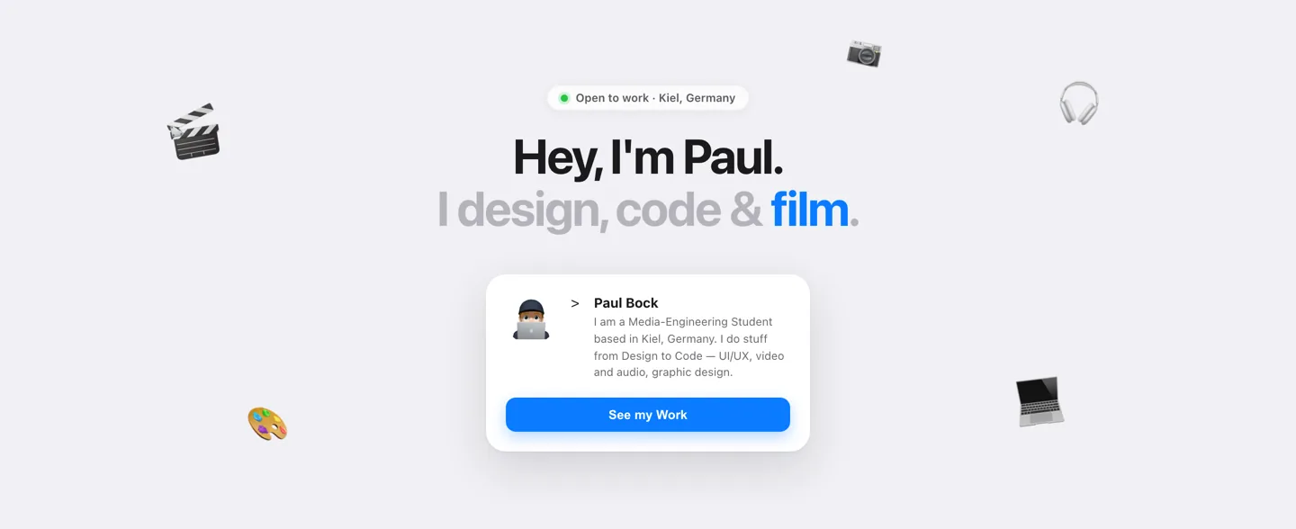
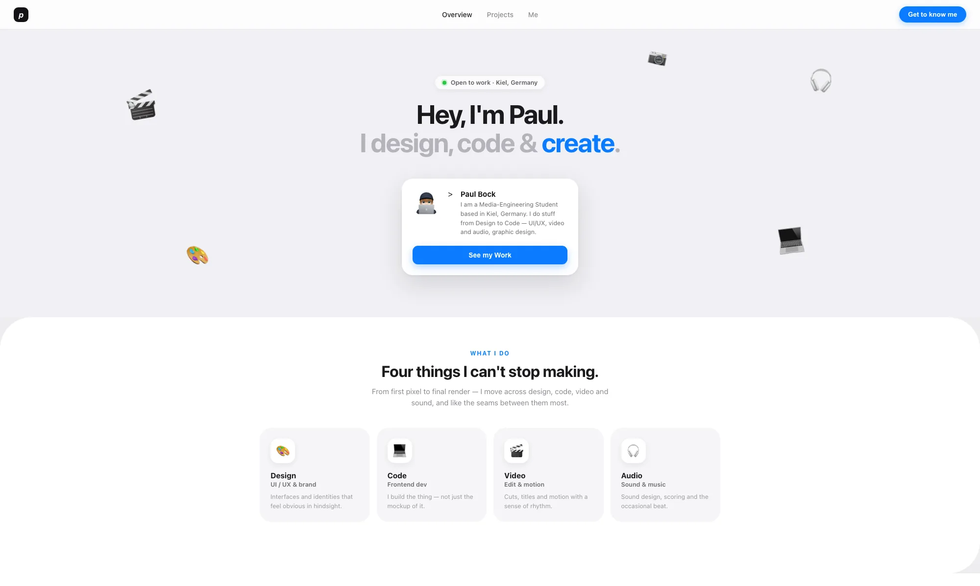
v3 hero: centred headline, floating emoji, a 360px profile card and a blue button
v3 — Hero
  1. v3 Accent blue spent on a word in the headline, and again on every button and label. Emphasis everywhere is emphasis nowhere.

    v4 One accent, under 5% of the canvas, only on state: live dot, active nav row, focus ring.

  2. v3 Five emoji dropped at absolute percentages, each with its own float animation and parallax depth. Decoration carrying no information.

    v4 Cut. The one image left in the hero is the avatar, sitting inside the line of type.

  3. v3 Identity lives in a max-width:360px card, centred — a widget you scroll past once.

    v4 Identity, nav, status and contact move into the persistent panel; always reachable, never scrolled away.

  4. v3 System font stack at fixed pixel sizes, centred, with a pill button under it.

    v4 Plex Sans and Plex Mono, 11 clamp() sizes, left-aligned — type scales with the viewport instead of snapping.

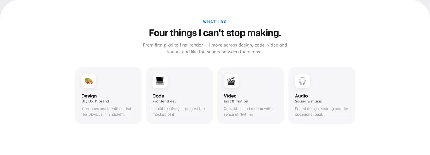
v3 “What I do” section: four equal cards in a fixed four-column grid
v3 — “What I do”
  1. v3 17 different border-radius values across the file — 64px on this section, 22px on the cards, 16px on a chip.

    v4 One 5px radius, applied through a single selector list. Chosen once.

  2. v3 repeat(4,1fr). Four columns are four columns at every width, so on a phone they are four slivers.

    v4 repeat(auto-fit,minmax(230px,1fr)) — a minimum column width, not a column count. No breakpoint needed.

  3. v3 Four cards saying what I do, above the work that would have shown it.

    v4 Section cut. The work grid opens the page; the claim and the evidence are the same object.

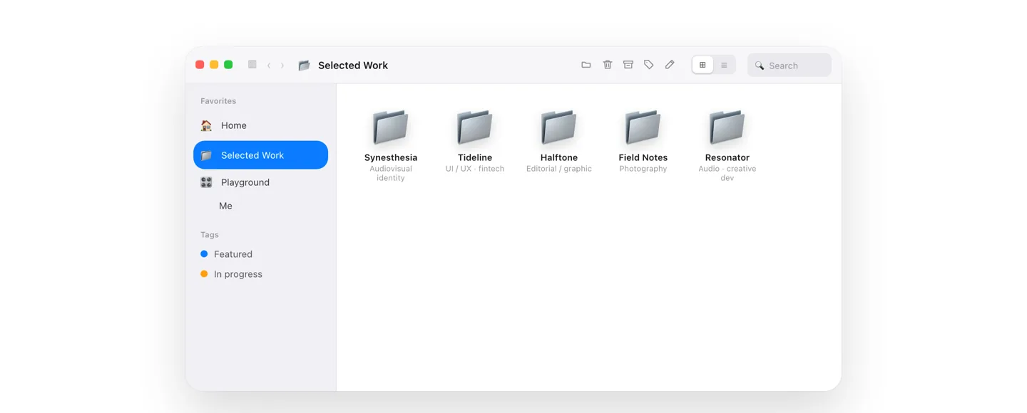
v3 work browser: a simulated macOS Finder window with folder icons and a large empty pane
v3 — Selected work
  1. v3 A drawn macOS Finder: traffic lights, back and forward arrows, a tag icon, a search field. None of it did anything.

    v4 Chrome removed. A grid and a list view that both actually switch, because they are the only two controls there.

  2. v3 Folder emoji standing in for six projects. The work is the point and it was represented by a glyph.

    v4 Covers, with placeholder plates where a render does not exist yet — labelled as missing rather than dressed up.

  3. v3 Sidebar rows shipped as {{ sb.me.bg }} — 123 editor bindings that only resolved because 114KB of tooling ran in the visitor’s browser first.

    v4 Rendered from one PROJECTS array in the same file. Nothing templated stays unresolved.

  4. v3 min-height:432px on the pane, so a short list left half the window blank.

    v4 No fixed heights. The grid is as tall as the work in it.

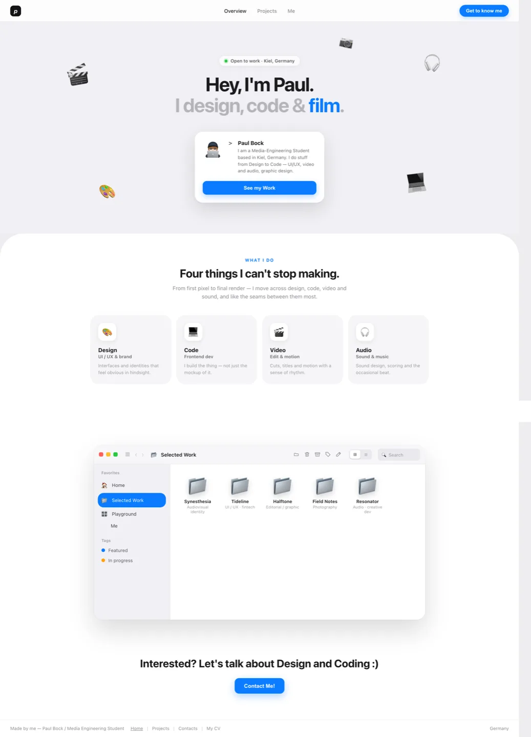
Full v3 page: the document is 1473px wide in a 1440px window, leaving a dead strip on the right
v3 — The whole page, at 1440px
  1. v3 The document measures 1473px in a 1440px window. That dead strip is the horizontal scrollbar the page gave every visitor whose screen was not mine.

    v4 Zero fixed widths. Nothing can be wider than the window it is in.

  2. v3 The cause: an empty contact block at position:absolute; width:1473px; height:59px; top:-59px — my window, written down as a layout.

    v4 Absolute positioning out, flow and grid in. The layout describes intent and lets the browser solve it.

02 — Root cause

The tool optimised for the canvas

None of this was one bad decision. A visual editor is honest about what it is: it writes down where I dragged something on the machine I dragged it on. That is a recording, not intent. “Centre this at 1473px” survives one screen; “this column is at least 230px wide, fit as many as you can” survives all of them. The rewrite is mostly a translation from the first sentence into the second.

03 — Design decisions

Why the new one looks like this

Eight decisions, each one answering something v3 got wrong rather than a style I liked.

Constraint

Hand-written, no build, no dependency

The rule that fixed the rest: if it does not fit in a file I typed myself, it does not go in. No framework to hide a bad layout behind, and no way to accidentally ship 114KB again — every byte is one I typed.

files: 5
dependencies: 0
build step: none

Type

One family, four sizes, one ratio

IBM Plex Sans and Plex Mono replace the system stack. Display sizes are clamp(), tracking tightens as size grows (−.03em to −.05em), and mono is reserved for labels, numbers and metadata — so a glance at the typeface already tells you whether you are reading prose or data.

clamp() sizes: 12
families: 2
label style: mono only

Colour

Near-monochrome, accent under 5%

v3 painted #0a7cff on every button, so emphasis meant nothing. Now the canvas is ink on paper and the accent (#ff4a17) is spent only on state: the live dot, the active nav icon, the focus ring, the hairline under the cursor. Emphasis is scarce, so it works.

hues: 1 + accent
accent coverage: <5%
dark mode: 6 token flips

Layout

Describe intent, let the browser solve

Absolute positioning out; repeat(auto-fit,minmax(230px,1fr)) in. The grid is told a minimum column, not a column count, so the same markup is three columns on a monitor and one on a phone with no breakpoint involved. Breakpoints are only where the intent genuinely changes.

@media queries: 6
fixed widths: 0
grid: auto-fit

Structure

A panel, not a header

The site is one page, so navigation should be ambient rather than something that pushes content down. Desktop gets a persistent 300px utility panel — identity, nav, status, contact in one place; under 880px the exact same element becomes a bottom tab bar with the rest in a drawer. One component, two shapes, no duplicate markup.

nav components: 1
breakpoint: 880px
duplicate nav markup: 0

Motion

Per element kind, not per page

v3 faded everything the same way, which is motion carrying no information. Here each kind moves like itself: headline words rise and rotate in, images wipe open with clip-path, tags pop, metrics count up out of blur. Durations sit at 120–520ms, and prefers-reduced-motion collapses all of it to 1ms with iteration-count 1 — a 1ms infinite loop is a strobe, not a stopped animation.

durations: 120–520ms
entrance kinds: 5
reduced-motion: honoured

Semantics

Reachable without a mouse

Real tab pattern on the case toggle, a real dialog for project detail — background gets inert so Tab cannot walk out of it, Escape closes, focus returns to the card that opened it. Focus is visible everywhere, in accent, on purpose.

aria / role attrs: 28
focus-visible: yes
focus return: yes

Detail

Hairlines that survive a reflow

Cells are drawn with a 1px box-shadow ring rather than the usual gap-filled grid trick, because auto-fit rows are uneven and the gap trick leaves broken lines when a row is short. One 5px base radius on every static corner, applied through a single selector list. The grid covers are the exception: they animate 14→26px on hover, chips 4→16px, so the corners stay concentric through the transition.

radius values: 6
grid gap hacks: 0
border method: ring
04 — Honest leftovers

What is still wrong with this one

Project covers are still placeholder plates, not renders. The idle log is localStorage only — it looks social and is not. The counted numbers are a snapshot of one commit, and they will drift the moment I edit any of these files. Kept visible rather than quietly fixed in a screenshot.

Open v3 exactly as it shipped ↗

Read the enquiry form →