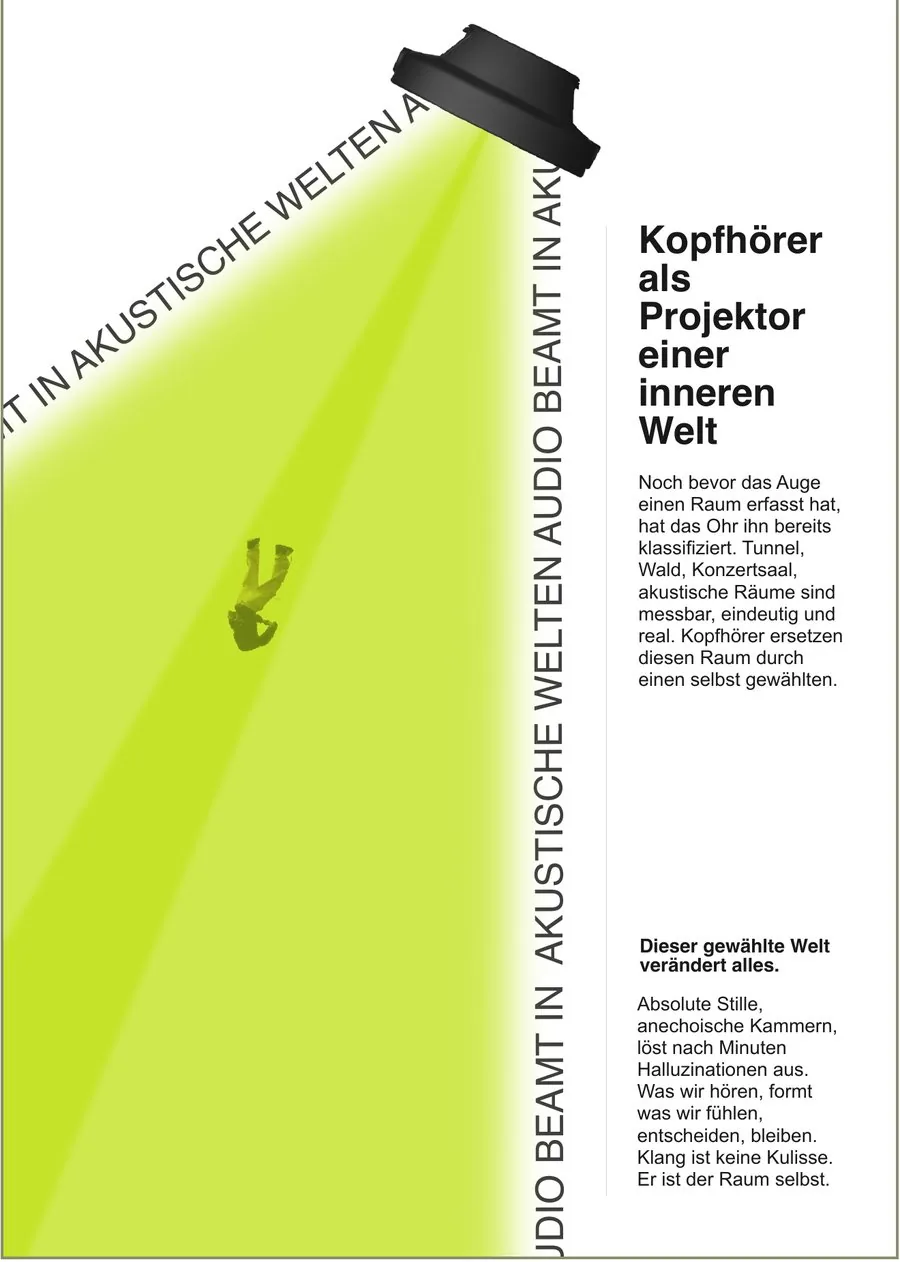
Das finale Plakat: ein Kopfhörer als Projektor, der einen grünen Strahl diagonal über den Bogen wirft, darin eine fallende Figur, Headline und zwei Textblöcke an der rechten Kante
Eine Hochschularbeit darüber, was Kopfhörer eigentlich tun: Sie spielen keine Musik in einen Raum, sie ersetzen ihn. Aus einer Objektanalyse wurde eine Metapher — der Kopfhörer als Traktorstrahl eines Raumschiffs — und diese Metapher musste dann ein Plakat, eine Infografik und einen Kurzfilm tragen. Fünf Plakatfassungen über zwei Experimente, jede von der folgenden Feedbackrunde erledigt. Dokumentiert als 20-seitiges Buch; die Doppelseiten unten sind dieses Buch.
5Plakatfassungen
2:40Filmlänge
87%ersetzen täglich ihre Realität
10msTon schlägt Bild
Was das für einen Auftrag heißt: eine Idee, die über Plakat, Infografik und Film hinweg trägt — die Kampagne liest sich als eine Sache, nicht als drei Freelancer, die in drei Richtungen ziehen.
Kernpunkte
Das Problem
Akustischer Raum ist unsichtbar. Der Moment, in dem ein Klangfeld gegen ein anderes getauscht wird, lässt sich nicht fotografieren — das ganze Projekt hing daran, ein Bild dafür zu finden.
Die Metapher
Das Kino gab die Antwort: Ein Projektor wirft eine Welt in einen Raum, die physisch nicht da ist. Kopfhörer tun das mit Klang. Jede spätere Entscheidung wurde an diesem einen Bild gemessen.
Die Iterationen
v1 verkaufte die Kopfhörermarke. v2 fand die Bedeutung, war aber überwiegend Weißraum. Ab v5 waren die Texte Signale statt Absätze.
Live → Film
Ein Live-Audioexperiment hatte in fünf Minuten zu viele Fehlerquellen, also wurde ein 2:40-Kurzfilm daraus: dieselbe Szene dreimal, drei Tonspuren.
01 — The problem
How do you show something invisible?
The object was a pair of headphones. The obvious answer to “what does this thing do” is: play music. The interesting one is: it replaces the acoustic field you are standing in. That is the thesis, and it is also the design problem — the transition from one sound field into another has no visual. It cannot be photographed, so it had to be invented. The answer came from an unexpected direction: cinema. A projector throws light into a room and creates a world that is not physically there. From that point the metaphor stopped being decoration and became the architecture — it decided what belonged in the project and what did not.
Object
From device to thesis
Driver, housing, cable, Bluetooth chip — on second look one of the most personal objects people carry all day. The analysis ended on a question rather than a feature list: if this many people replace their acoustic field daily, what does that do to how we perceive rooms, situations and ourselves?
The research was not only desk work. Same route, once with headphones, once without — the city as soundscape versus the city as backdrop. That is where the sentence the whole book turns on came from: Du bist nicht mehr Teil der Stadt. Du bist durch sie hindurch.
sources: 9
chapters: 9
Constraint
Poster as the primary medium
A poster forces reduction; there is no room for being undecided. Choosing it as the lead medium first is what made everything after it decide things.
format: A2 portrait
colours: 3
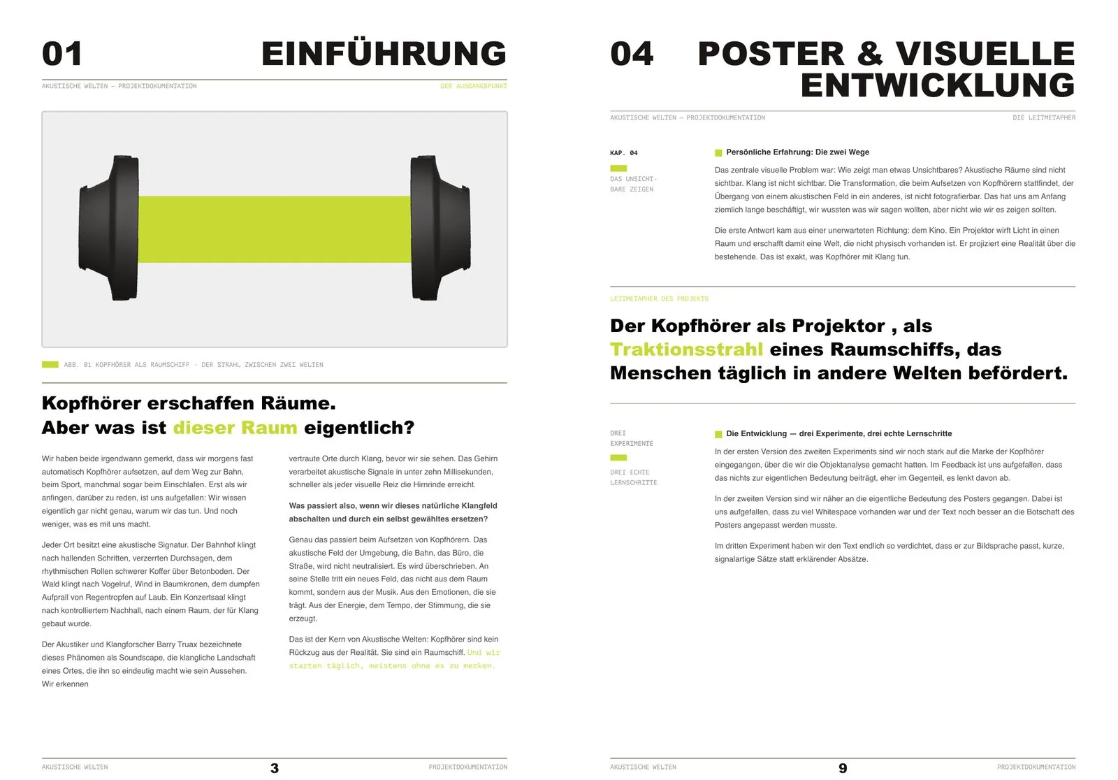
Chapters 01 & 04 — the thesis and the metaphor
The opening image is the argument in one object: two ear cups with the beam running between them. A headphone drawn as a transport, not as a product shot.
Every chapter lands on one green sentence rather than a summary paragraph. Here: Kopfhörer erschaffen Räume. Aber was ist dieser Raum eigentlich? — the question the rest of the book answers.
The guiding metaphor gets its own typographic block, set apart from the body: the headphone as the tractor beam of a spaceship that moves people into other worlds daily. Everything downstream — the diagonal, the falling figure, the running text — is a consequence of this one sentence.
Three experiments, three real learning steps. The book states up front that the versions were wrong before they were right, which is the part of a process most documentation quietly deletes.
02 — The iterations
Five versions, three of them wrong
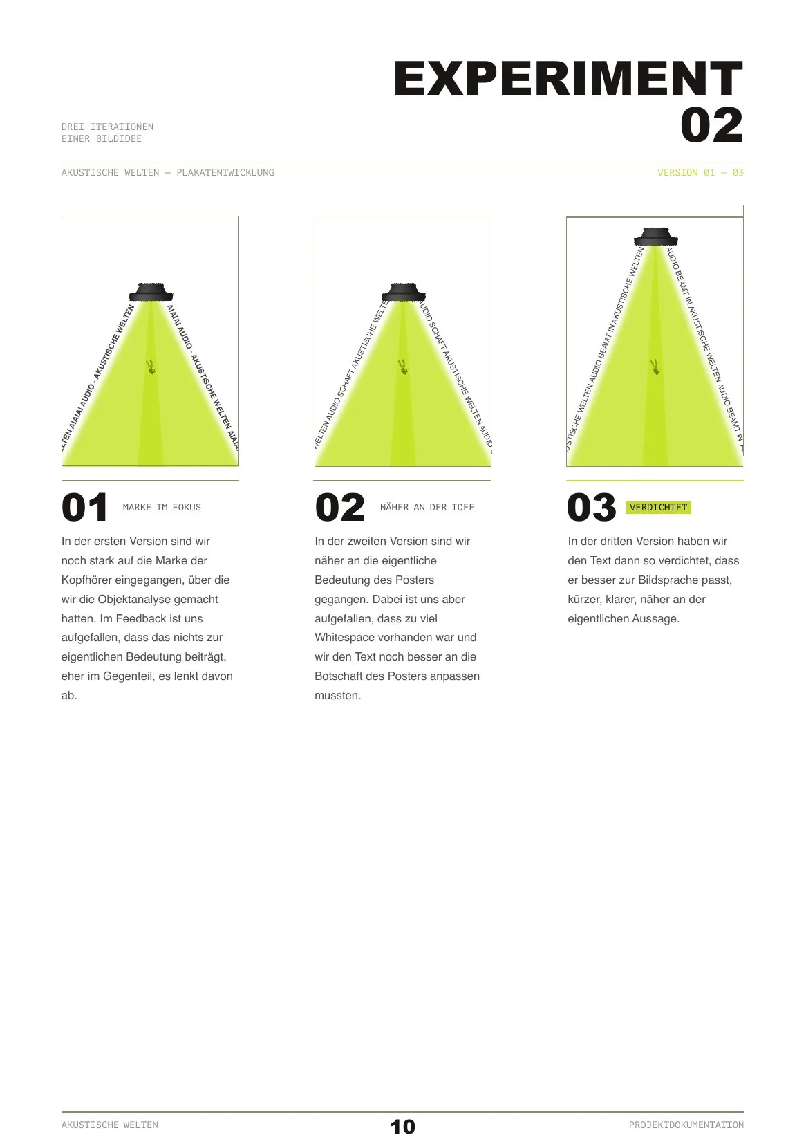
Nothing here was a redraw for its own sake. Each version went into a feedback round and came back with one specific fault, and that fault is what the next version answers. The order matters: first the content was wrong, then the composition, then the copy length, then the type hierarchy.
Experiment 02 — versions 01 → 03
01 — Marke im Fokus. The running text along the beam carries the headphone brand, left over from the object analysis. Feedback was blunt: it adds nothing to the meaning and pulls attention away from it. The brand of the object was never the subject; the effect was.
02 — Näher an der Idee. Brand out, statement in: Audio schafft akustische Welten. Now the poster is about the phenomenon, and the repetition along both beam edges starts doing compositional work instead of just labelling the image. Remaining fault: too much empty sheet.
03 — Verdichtet.schafft becomes beamt. One verb, and the metaphor moves into the copy instead of living only in the picture. Shorter, more signal-like, closer to what the image already says.
The three-up on one page is deliberate: the versions are only readable as an argument next to each other. Alone, each looks finished.
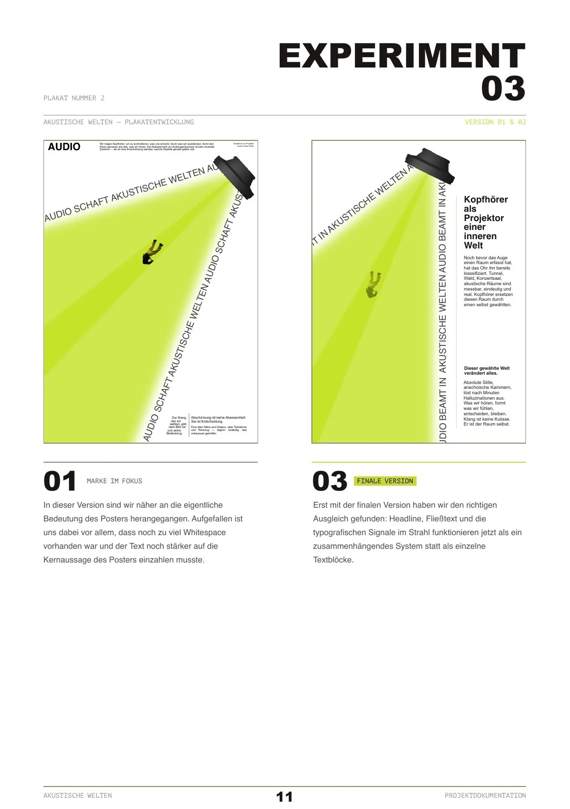
Experiment 03 — the diagonal and the final poster
The beam goes diagonal and the projector moves into the corner. Movement instead of symmetry — the sheet now has a direction, and the falling figure has somewhere to fall from.
Still wrong: large empty areas, and text that does not yet pay into the core statement strongly enough. The small blocks read as a caption attached to the image rather than part of it.
Final. The headline Kopfhörer als Projektor einer inneren Welt sits compact at the right edge, exactly where the beam starts — as if it were coming out of the projector itself. Position carries part of the argument.
Two short body blocks instead of one long one. A single block would have made the poster text-heavy and pushed the actual composition — beam, falling figure — into the background.
The diagonal running text has a double job: graphic element and message at once. Repeating it creates a pull down the sheet that supports the direction of the beam, instead of being a caption. Headline, body and running text finally support each other rather than compete.
03 — The infographic
Same beam, different logic
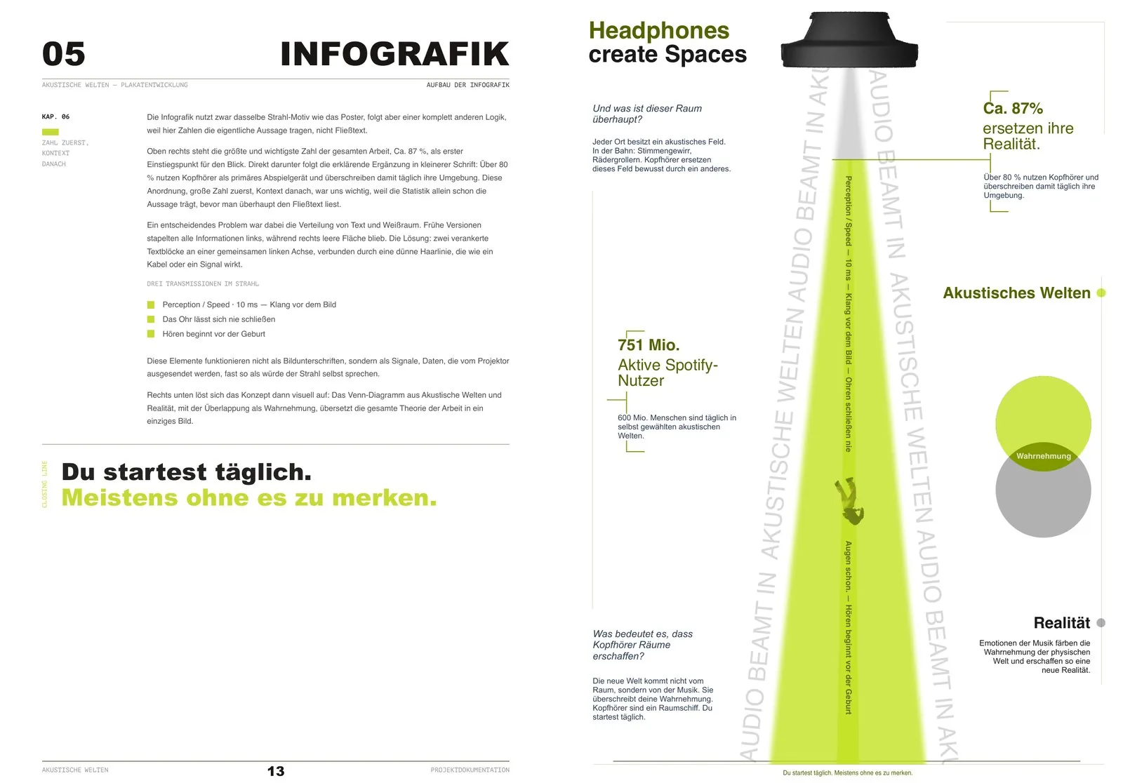
The infographic reuses the beam motif but cannot be built like the poster: here the numbers carry the statement, not the body copy. So the reading order is designed around figures, and the real layout problem was the distribution of text and whitespace — early versions stacked everything on the left and left the right side empty.
Chapter 05 — the reasoning, and the result
Big number first, context after. Ca. 87% goes top right as the entry point for the eye, with the qualifying line under it in smaller type — the statistic already carries the statement before anyone reads body copy.
The whitespace fix, written down: two text blocks anchored on one shared left axis, joined by a thin hairline that reads like a cable or a signal.
Every chapter ends on its closing line. Here it is the line the whole project ends on: Du startest täglich. Meistens ohne es zu merken.
The 87% figure in place on the sheet, with its explanation bracketed underneath rather than floating next to it.
Three facts sit inside the beam as transmissions — perception speed, ears never close, hearing starts before birth. Not captions: signals emitted by the projector, as if the beam itself were speaking.
The Venn of Akustische Welten and Realität, overlapping in Wahrnehmung, translates the entire theory of the project into one figure.
04 — Planning & the film
Structuring it, then killing the live experiment
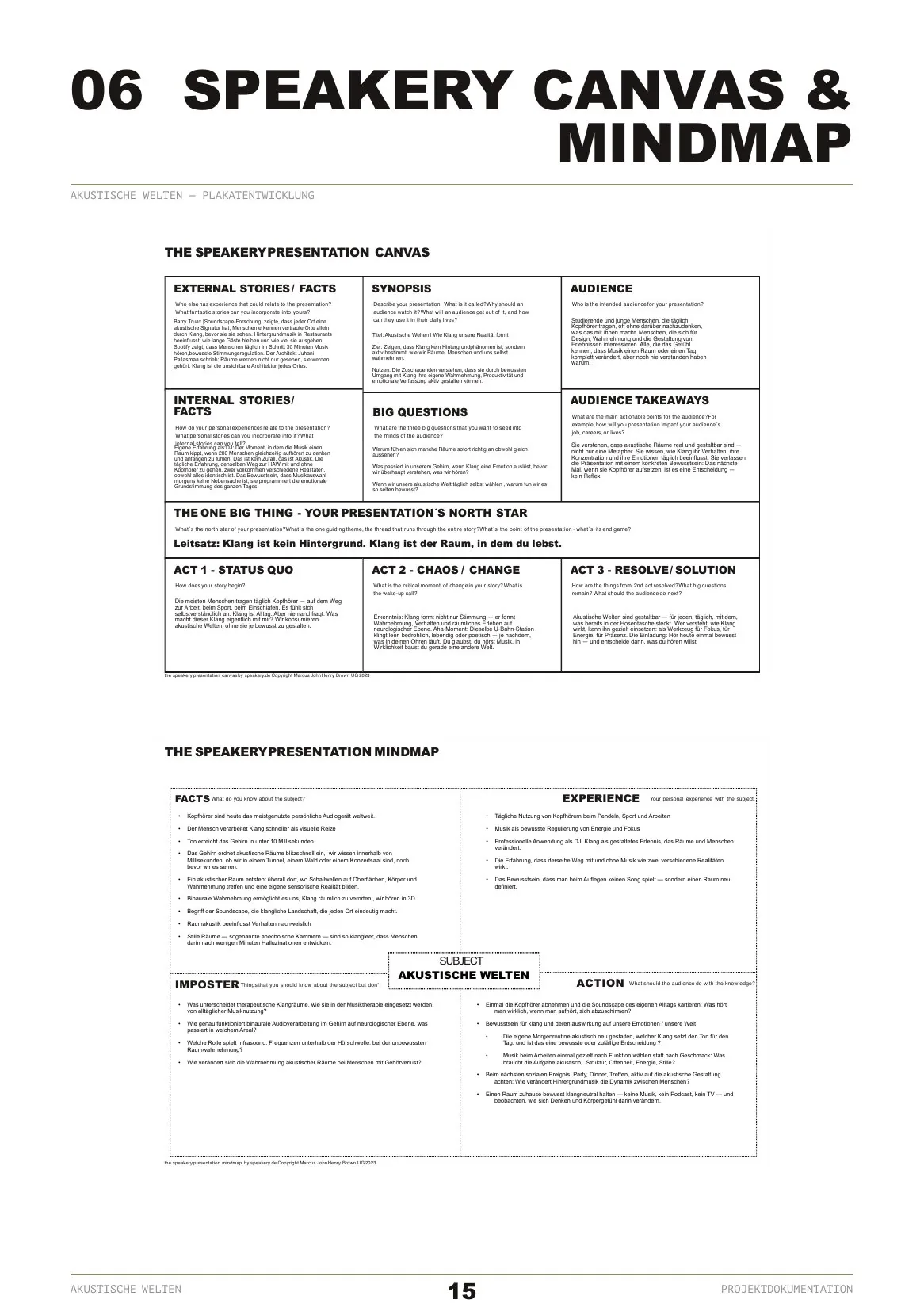
Between the artefacts and the presentation sat the part nobody photographs: deciding what the five minutes in front of an audience actually had to do. A Speakery canvas and a mindmap forced the argument into three acts and one north-star sentence — Klang ist kein Hintergrund. Klang ist der Raum, in dem du lebst. That structure is what made the next decision easy.
Chapter 06 — Speakery canvas & mindmap
Audience, synopsis, takeaways, big questions — filled in before any slide existed. The canvas is what turns “we have material” into “we know what this is for”.
The north-star line sits in the middle of the canvas and every later cut was measured against it. One sentence, and the presentation has a spine.
Three acts: status quo, chaos, resolve. Status quo is the commute on autopilot; chaos is the realisation that the sound field is chosen, not given; resolve is the conscious relationship with it.
The mindmap holds the honest quadrant — imposter, the things we could not claim: therapeutic effects, binaural audio as manipulation, infrasound. Naming what the project does not cover is what kept the claims defensible.
Chapter 07 — from live experiment to short film
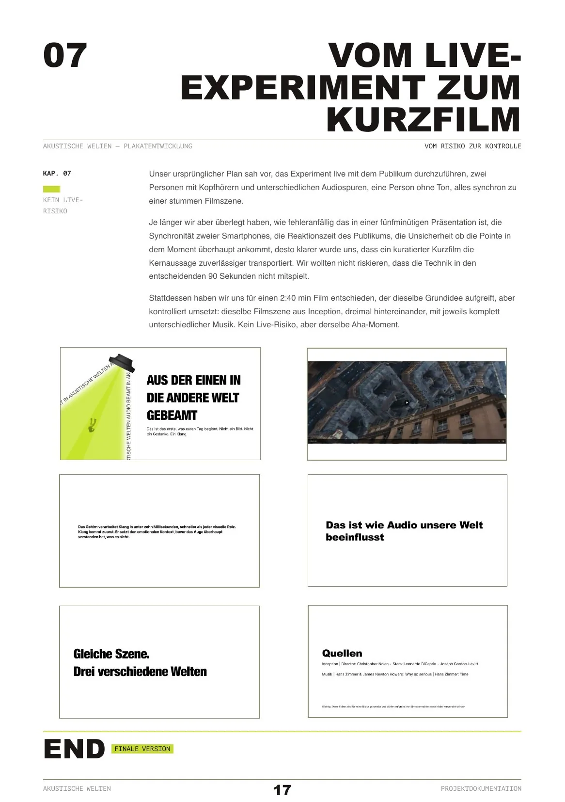
The original plan: run the experiment live — two people on headphones with different tracks, one without, all watching the same silent scene.
Killed on risk. Two phones staying in sync, an audience reacting on cue, no guarantee the point lands in the ninety seconds that matter. A curated film carries the core statement more reliably than a live setup that can fail in front of the room.
The film opens in the same visual language as the poster — beam, headline, one short line. Continuity across media was cheaper than designing a second system.
The scene itself: the same Inception sequence, three times, three completely different scores. The change happens in the viewer, not on screen — the thesis demonstrated instead of explained.
Gleiche Szene. Drei verschiedene Welten. The whole argument as one sentence, placed immediately before the demonstration so the audience knows what to watch for.
2:40 in the end, not five minutes. Sources on screen, including the note that the footage is for educational use.
Chapter 08 — what worked, what was hard
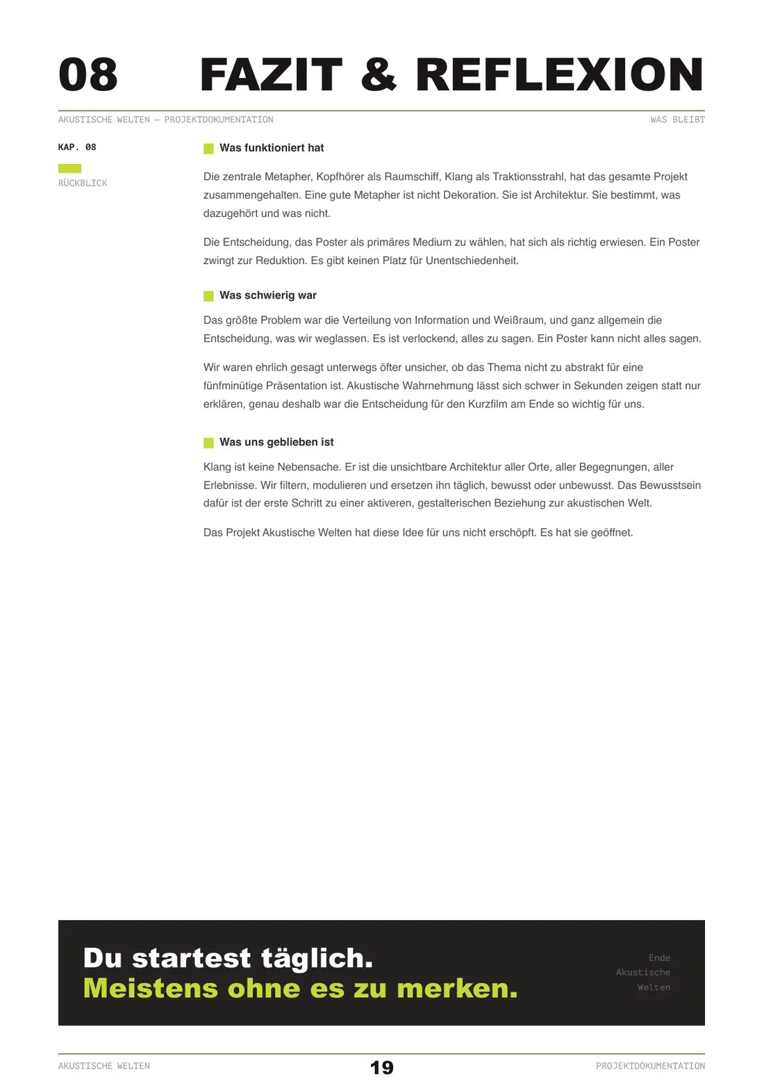
What worked: the metaphor held the whole project together. A good metaphor is not decoration, it is architecture — it decides what belongs and what does not.
What worked: choosing the poster as the lead medium. A poster forces reduction; there is no room in it for being undecided.
What was hard, stated plainly: the distribution of information and whitespace, and the temptation to say everything. Also the doubt — whether acoustic perception is too abstract to show in five minutes rather than explain. That doubt is exactly why the film mattered.
The book closes the way the infographic does, on the same line: Du startest täglich. Meistens ohne es zu merken.